Client
LP Squared
Project
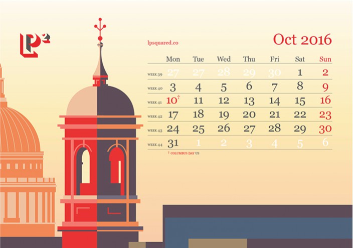
2016 calendar
The design of a calendar is a favourite of ours. This year we wanted to bring to life the seasons throughout the pages of the calendar. LP Squared identity uses a strong red, dark grey and white palette, we added a colour palette to complement and enhance the brand. We created new illustrations and had the calendar printed in beautiful GF Smith Colorplan card stock.
Concept and design
Willem Heskes
Lola Stalenhoef
Illustrations
Kimiko Taro


